Responsive Phone Browser a Mac app
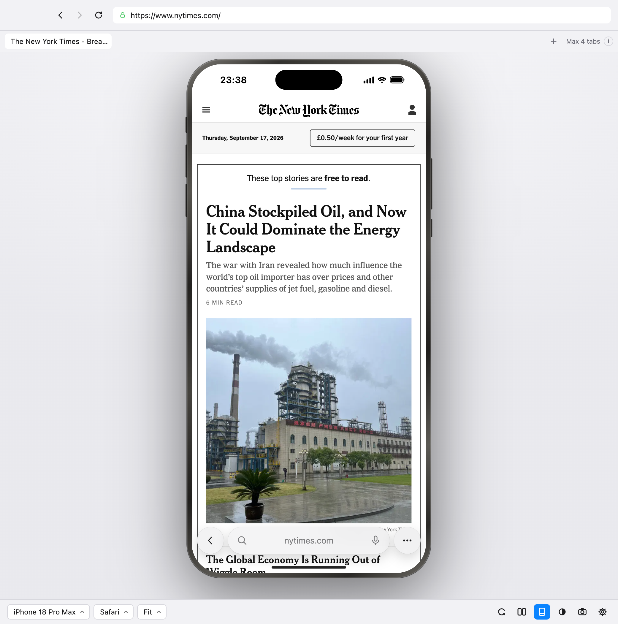
Check your website on an iPhone without one.
Now supporting iPhone Duo.
Type a URL, see a phone
No iPhone Mirroring, no device on your desk, no digging through responsive mode. Open the app, paste a link, and the page is already running at phone size.
Now supporting iPhone Duo
Apple’s foldable, inner and outer displays, Split View and the physical poses — book, tent, laptop. Check how your site folds before anyone is holding one.
Real rendering, not a resized window
A genuine mobile viewport with the device’s pixel ratio, safe-area insets, touch events and iOS user agent — with Safari, Chrome or Vivaldi drawn around your page.
iPhone Duo, iPhone 18 and 17 Pro, the 16 and 15 range, Pixel — every display, every pose.